
The Basics of Great Website Designs
Imagine getting excited about starting a new web design project, only to find yourself staring at a blank piece of paper or white Photoshop canvas. Design mental blocks are not uncommon, but here are some basic principles that will surely help provide some inspiration, ideas and get you out of your rut.
Client Feedback
By far the most important factor in all web design projects. While you may have a great idea for a design, remember that a lot of it is subjective. Gather critical input from your client before starting anything! Here are some typical questions I like to ask all my clients.
- What does the company represent?
- What goods or services does the company offer?
- Does the company have an existing logo or branding identity?
- What is the overall goal for the website?
- List out some competitor sites and discuss what works for them.
- Any design style or color preferences?
- What is the company's desired target audience and demographics?
With this preliminary information in hand, you will be able to conjure up some design magic and develop several preliminary layout sketches that is in line with your client's expectations.
Defining Good and Bad Web Design
The most important element that makes or breaks a website is communication. You don't want a website that “works” but looks terrible, or doesn't fit with your client's branding identity. Nor do you want to design a website that looks fantastic, but is so inaccessible that visitors cannot decipher how to navigate to an interior page.
You should always strive to create a nice balance, so that your users find the design pleasing, but are interested in the content at the same time. The main navigation menu should always be clearly visible on the web page, and each link/tab should have a descriptive title. Having menu buttons that changes appearance, as well as indicate which active page/section helps your visitors get a bearing on where they are and how to further proceed deeper into the website as a whole. Breadcrumbs (e.g. Home > Products > Web Design Books) are also a great way to indicate the current architecture.
Overall Website Design Cohesiveness
Always try to keep an underlying theme on all pages, even if the scope of work requires some pages to be dramatically different. By doing so, you help tie in and hold the design of the overall website together.
Keep It Simple
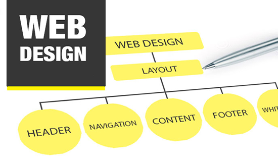
Most websites have very similar structures. Logos on the top left, menus horizontally or in a left column and content as the focal point of the web page. Although there are many different ways to organize the various elements, only a few arrangements are intuitive. Keeping the web page anatomy simple and intuitive is a no-brainer.
Whitespace
Whitespace (or negative space) refers to any section of a design that's not filled in by type or images. Many novice web designers and some clients often feel a need to fill every inch of a web page with images or content. What they don't realize is that having whitespace on a page is just as critical as having content. Without this whitespace, the overall design will feel crowded and unbalanced. The visitor will not know what to focus on. Negative space helps a design “breathe”.
The Golden Ratio and Balance
Classic design patterns such as the golden ratio (divine proportion) help create layouts that are considered to be aesthetically pleasing. The Renaissance artists exclusively used the divine proportion to design their sculpture, architecture and paintings. So it stands to reason that by following this basic and logical principle, we have the basic guidelines for designing appealing layouts.
Always keep an eye out for the overall balance of your design. Don't load up one column with content and leave the neighboring column relatively empty. Make sure the elements on either side of a layout are of balanced in a logical manner.
Unity
A unified design layout is one that works as a whole rather than being identified as separate individual components. The different elements of a design should interact with one another in a unified manner so the overall design looks planned and organized.
Screen Resolution
At the time of writing this article, the preferred fixed width layout is for monitors of the 1024 x 768 setting. What this means, is that you should try to keep your layout width to no more than 950 pixels wide. There is nothing more annoying than having to scroll left and right when viewing a website.
Some Great Web Galleries
Here is a selection of websites that offer great ideas and inspiration.